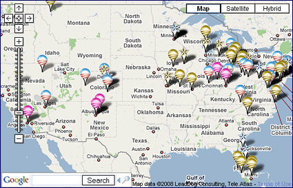
Slate’s “Map the Candidates” has been around since the primaries, but it’s still a great example of a simple idea that’s nonetheless revealing — just a straightforward Google Maps interface that lets you see where the campaigns are sending their big guns and when. What makes it useful is that the display is multi-dimensional, in that you can easily and intuitively adjust sliders to look at different blocks of time. What pops out is where the campaigns think they should make a splash — the industrial/battleground states get the most attention, but note the Democrats’ focus on Virginia and slight spillover into North Carolina. The current Obama/Palin face-off in the West also stands out, along with Michelle Obama’s earlier trip to the desert.
If it’s possible, a great addition to the maps would be an overlay layer that shows what TV and web ads the campaigns are running, where and in what volume — that way you could REALLY see where resources are being spent. Of course you could get the same information from a simple list of places and dates, but the visual display makes the patterns much more obvious.
– cpd