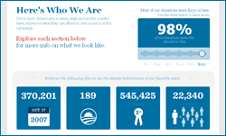
Here’s a little something to check out: a few days back, the Obama campaign published a very clever infographic that lays out information they’d like you to know about the 1,000,000 people who’ve donated to the President’s 2012 reelection effort so far. The fun part is that it’s interactive — i.e., you can play with it to find things out (technical note: it uses javascript/dhtml rather than Flash, which no doubt helps with accessibility).
For instance, you can move a slider to find out what percentage of donations fell into certain ranges (for instance, 95% were $150 or less). Or, you can click days of the week to find out what hours saw the most donations (handy for other online communicators looking for benchmarks), see which professions dominate the donor base, how many new donors were recruited by friends and family, or check out how many people gave money from a given state or state-like entity (DC!).
Of course, the numbers reflect a narrative that the Obama campaign would like to portray: that its donors are part of a broad-based movement representative of the country as a whole, not some kind of coastal phenomenon dominated by the “liberal elite” or a handful of moneyed political bigwigs. One thing that’s clear? Just as in 2008, Obama will be able to go back to his small donors again and again throughout the primary and general election process, while his chief opponents (in this case, Romney and Perry) are relying (overwhelmingly so far) on a relatively small group of geographically or professionally restricted donors who’ll hit their legal maximum on campaign giving quickly.
– cpd

