Michelle Coyle Edwards is Vice President of Rising Tide Interactive (RTI). Read her previous work on Epolitics.com.
When Hillary Clinton made her much–anticipated announcement that she’d be running for president, the inevitability of the act led to a vacuum in the peanut gallery, where speculation about a candidate’s timing and motivations generally resides. Something had to fill that vacuum. Enter: Logo-gate.
![]()
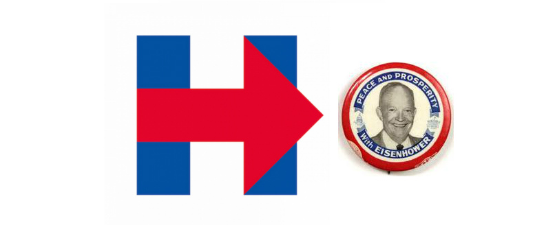
Said gallery’s commentary on the newly unveiled Hillary for America logo flew fast and furious, with raw emotion unleashed and uncensored in a way that only the internet can facilitate. Sentiments such as, “It looks like a hospital signâ€, “did they make it in MS Paint?â€, and “do they realize it points to the right?†were some of the more printable opinions that this writer came across in the days following its release. While a few responses were more positive, praising the mark’s modern simplicity, the vast majority came from critics who seemed baffled that with all of the time, preparation, money, and fanfare accompanying Clinton’s second run for the White House, this was the best they could do.
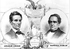
It got me thinking about presidential campaign logos throughout history, and how the nature of our American propaganda and political branding has changed over time. Time was, you could put the black-and-white cutout heads of two old white guys on a red-and-blue button and call it a day. Why the sudden ire over something that clearly required branding experts, professional designers, and quite a bit of strategic thought? Could it be because it’s such a departure from what we’re used to? Or is it really just…bad?
While it’s nearly impossible to take an objective look at art, it certainly helps to consider the functional needs (the “use caseâ€, in nerd-speak) of a logo when considering its utility. Sometimes, in the famous words of Marshall McLuhan, “the medium is the message.†In the nineteenth century, political cartoons were all the rage, and serious campaign materials in the form of posters and handouts sought to combat them with stately, artistic renderings of candidates.
As soon as photography was in widespread use, black and white portrait renderings replaced these drawings and the campaign button was born. As these buttons traveled around with supporters, potential voters could get an accurate look at the leaders they might be selecting to run the country.
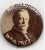
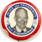
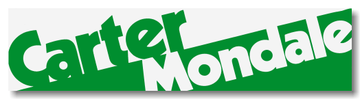
By the middle of the last century, these buttons (still going strong!) had been punched up with patriotic color schemes and punchy slogan text.
The 1960’s brought the advent of the televised campaign, a fact reflected in the trend toward text-only campaign branding. Candidate’s names stayed firmly planted on lawn signs and traveled around town on bumper stickers. By the 70’s, stylized word-mark logos were all the rage.
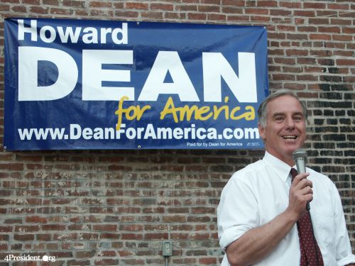
Of course, the dawn of the Internet Age really served to revolutionize campaign design. In 2004, Howard Dean’s team seized the burgeoning opportunity to create a grassroots movement online and his campaign branding reflected this irreverence and a new world order: who can forget the iconic, bold, white “DEAN†in all caps on a blue background, a yellow “for America†scrawled across the bottom as if an afterthought by a supportive graffiti artist..
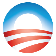
And in 2008, Barack Obama was the first candidate to take his name almost entirely out of the branding equation, leaving supporters instead with the wearable and sharable dawn-of-a-new-day “Oâ€, brilliant in it’s simplicity, rendering and image of the sun shining over a field which also happened to be the American flag.
Which brings us nearly to the present day. Whereas for the last decade or so, voters flocked to the internet to find out more about their candidates or contribute to campaigns, they now spend five hours a day online. The average American spends nearly two of those hours on social networks. With the most successful campaigns of the past several years in both the political and advocacy spheres having a viral component (remember that time all of your Facebook friends changed their profile pictures to equal signs to show their support for marriage equality?), iconography is key.
When you think about what works for profile pics, twitter avatars, iPhone backgrounds, bumper stickers AND buttons (still holding on!), the Hillary for America “H†starts to seem pretty smart. Granted, it’s only been a week, but I have yet to see anyone swap out a picture of their own face in favor of this:
Food for thought.